
JQuery Responsive Slider Yapımı Bootstrap 3 Uyumlu
JQuery Kullanmak bize bir çok kolaylık sağlamaktadır, az kodla çok iş yapmamıza yardımcı olduğu gibi internette bir çok ücretsiz dağıtılmış slider, galeri, tarih seçici, menü gibi bir çok eklentiyide istediğimiz gibi indirip kullanabiliyoruz. Şimdi bizde jQuery Responsive Slider Yapımı Bootstrap 3 Uyumlu konusuna değineceğiz.
Örnek olarak jQuery ve Bootstrap kullanarak responsive özelliğe sahip bir çalışma yaptım bunu açıklayacağım. Slider için yazdığım eklentinin içerisinde jQuery timer eklentisi kullandım. Şimdi bu plugin kodlarını yazalım ve inceleyelim. En sonda kodların çalışır halini indirilebilir olarak paylaşacağım isteyenlerin internet sitelerinde kullanabilmesi için.
Kullanmak için eklenmesi gereken jquery pluginler;
jquery.js
bootstrap.js
responsive-slider.js
jQuery hazır slider plugin kodlarımız aşağıdaki gibi. Kod aralarına açıklama satırları ile açıklamalar yazdım, bu açıklamaları okuyarak mantığı hakkında bilgi alabilirsiniz.
jQuery Bootstrap Uyumlu Responsive Slider Eklentisi Kodları
|
1 2 3 4 5 6 7 8 9 10 11 12 13 14 15 16 17 18 19 20 21 22 23 24 25 26 27 28 29 30 31 32 33 34 35 36 37 38 39 40 41 42 43 44 45 46 47 48 49 50 51 52 53 54 55 56 57 58 59 60 61 62 63 64 65 66 67 68 69 70 71 72 73 74 75 76 77 78 79 80 81 82 83 84 85 86 87 88 89 90 91 92 93 94 95 96 97 98 99 100 101 102 103 104 105 106 107 108 109 110 111 112 113 114 115 116 117 118 119 120 121 122 123 124 125 126 127 128 129 130 131 132 133 134 135 136 137 138 139 140 141 142 143 144 145 146 147 148 149 150 151 152 153 154 155 156 157 158 159 160 161 162 163 164 165 166 167 168 169 170 171 172 173 174 175 176 177 178 179 180 181 182 183 184 185 186 187 188 189 190 191 192 193 194 195 196 197 198 199 200 201 202 203 204 205 206 207 208 209 210 211 212 213 214 215 216 217 |
(function($) { "use strict"; /* jQuery Timer Plugin Bu eklentii hazır olarak kullandım. */ $.timer = function(func, time, autostart) { this.set = function(func, time, autostart) { this.init = true; if(typeof func == 'object') { var paramList = ['autostart', 'time']; for(var arg in paramList) {if(func[paramList[arg]] != undefined) {eval(paramList[arg] + " = func[paramList[arg]]");}}; func = func.action; } if(typeof func == 'function') {this.action = func;} if(!isNaN(time)) {this.intervalTime = time;} if(autostart && !this.active) { this.active = true; this.setTimer(); } return this; }; this.once = function(time) { var timer = this; if(isNaN(time)) {time = 0;} window.setTimeout(function() {timer.action();}, time); return this; }; this.play = function(reset) { if(!this.active) { if(reset) {this.setTimer();} else {this.setTimer(this.remaining);} this.active = true; } return this; }; this.pause = function() { if(this.active) { this.active = false; this.remaining -= new Date() - this.last; this.clearTimer(); } return this; }; this.stop = function() { this.active = false; this.remaining = this.intervalTime; this.clearTimer(); return this; }; this.toggle = function(reset) { if(this.active) {this.pause();} else if(reset) {this.play(true);} else {this.play();} return this; }; this.reset = function() { this.active = false; this.play(true); return this; }; this.clearTimer = function() { window.clearTimeout(this.timeoutObject); }; this.setTimer = function(time) { var timer = this; if(typeof this.action != 'function') {return;} if(isNaN(time)) {time = this.intervalTime;} this.remaining = time; this.last = new Date(); this.clearTimer(); this.timeoutObject = window.setTimeout(function() {timer.go();}, time); }; this.go = function() { if(this.active) { this.action(); this.setTimer(); } }; if(this.init) { return new $.timer(func, time, autostart); } else { this.set(func, time, autostart); return this; } }; /* jQuery Responsive Slider Bootstrap 3 Uyumlu */ $.fn.responsiveSlider = function(options){ // Plugin için varsayılan ayarların tutulduğu objemiz. var defaults = { sliderClass: ".responsive-slider", // Slider class adı. prevControl: ".btnPrev", // Önceki Slider buton elemanı nextControl: ".btnNext", // Sonraki Slider buton elemanı paginationClass: ".page-controls", // current: 0, speed: 3000, // Slider Hızı hoverPause: true, // Üzerine Gelince Dursun mu? pagination: true, // Sayfalama Olsun mu? effect: "easeOutSine", // Slider Geçiş Efekti effectSpeed: 750, // Efekt Hızı autoPlay: true, // Otomatik Başlatılsın mı? background: "#fff" // Slider Arkaplan rengi }; // Eğer eklenti kullanılırken ayarların üzerine yazılırsa yeni ayarlar kullanılacak aksi durumda varsayılan ayarlar geçerli olacak. var s = $.extend({}, defaults, options); // Başlangıçta ilk slide'ı gizliyoruz. $(s.sliderClass + " ul li").hide().eq(0).show(); // Slide arka rengini belirliyoruz. $(s.sliderClass).css({backgroundColor: s.background}); // Sonraki slide geçişini sağlayan function function nextSlider(){ if (s.current < $(s.sliderClass + " ul li").length-1) { $(s.sliderClass + " ul li").eq(s.current).hide(); s.current ++; $(s.sliderClass + " ul li").eq(s.current).fadeIn(s.effectSpeed, s.effect); } else { $(s.sliderClass + " ul li").eq(s.current).hide(); s.current = 0; $(s.sliderClass + " ul li").eq(s.current).fadeIn(s.effectSpeed, s.effect); } $(s.paginationClass + " ol li").removeClass("active"); $(s.paginationClass + " ol li").eq(s.current).addClass("active"); } // Önceki slide geçişini sağlayan function function prevSlider(){ if (s.current == 0) { $(s.sliderClass + " ul li").eq(s.current).hide(); s.current = $(s.sliderClass + " ul li").length-1; $(s.sliderClass + " ul li").eq(s.current).fadeIn(s.effectSpeed, s.effect); } else { $(s.sliderClass + " ul li").eq(s.current).hide(); s.current --; $(s.sliderClass + " ul li").eq(s.current).fadeIn(s.effectSpeed, s.effect); } $(s.paginationClass + " ol li").removeClass("active"); $(s.paginationClass + " ol li").eq(s.current).addClass("active"); } // İstenilen slide a giden function function goSlider(number){ $(s.sliderClass + " ul li").hide(); s.current = number; $(s.sliderClass + " ul li").eq(s.current).fadeIn(s.effectSpeed, s.effect); $(s.paginationClass + " ol li").removeClass("active"); $(s.paginationClass + " ol li").eq(number).addClass("active"); } // Zamanlayıcı tanımlıyoruz. var timer = $.timer(function(){ nextSlider(); }, s.speed, false); // Slide oynatma, durdurma, gibi fonksiyonlar. var play = function() { timer.play(); }, pause = function(){ timer.pause(); }, go = function(slideIndex){ goSlider(slideIndex); timer.reset(); }, next = function(){ timer.once(); timer.reset(); }, prev = function(){ prevSlider(); timer.reset(); } // Eğer ayarlarda otomatik oynatma aktifse sayfa yüklendiğinde slide başlatılıyor. if (s.autoPlay) { play(); } //Sayfalama özelliği ayarlardan pasif edilmişse sayfalamayı gizliyoruz. if (!s.pagination) { $(s.paginationClass).hide(); } // Sonraki slide olayı. $(s.nextControl).on("click",function(e){ next(); }); // Öceki slide olayı. $(s.prevControl).on("click",function(e){ prev(); }); // Mobil cihazlar için sola kaydırma yapıldığında sonraki slide gidiyor. $(s.sliderClass).on("swipeleft", function(){ next(); }); // Mobil cihazlar için sağa kaydırma yapıldığında önceki slide gidiyor. $(s.sliderClass).on("swiperight", function(){ prev(); }); // Eğer ayarlarımızda slide üzerine mouse geldiğinde durdurulması etkinse slide durduruyor. $(s.sliderClass).on("mouseover",function(e){ if (s.hoverPause) { timer.pause(); } }); // Mouse slide üzerinden çekildiğinde oynatmaya devam ettiriliyor. $(s.sliderClass).on("mouseover",function(e){ timer.play(); }); // Sayfalamada sayfa numarasına tıklandığında o slide a gidiyor. $(s.paginationClass + " ol li").on("click", function(){ go($(this).index()); }); } })(jQuery); |
jQuery Pluginimiz hazır şimdi html sayfamız içerisinde nasıl kullanırız onu inceleyelim.
HTML (Hyper Text Markup Language)
|
1 2 3 4 5 6 7 8 9 10 11 12 13 14 15 16 17 18 19 20 21 22 23 24 25 26 27 28 29 30 31 32 33 34 35 36 37 38 39 40 41 42 43 44 45 46 47 48 49 50 51 52 53 54 55 56 57 58 59 60 61 62 63 64 65 66 67 68 69 70 71 72 73 74 75 76 77 78 79 80 81 82 83 84 85 86 87 88 89 90 91 92 93 94 95 96 97 98 99 100 101 102 103 104 105 106 107 108 |
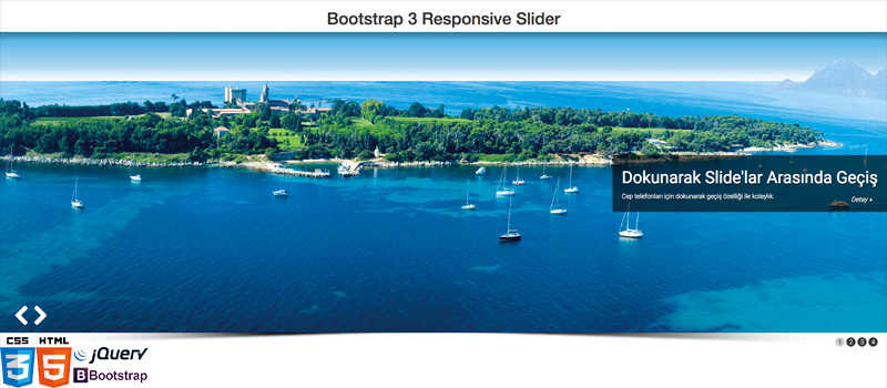
<!DOCTYPE html> <html lang="tr"> <head> <meta charset="utf-8"> <meta http-equiv="X-UA-Compatible" content="IE=edge"> <meta name="viewport" content="width=device-width, initial-scale=1"> <title>Bootstrap 3 Responsive Slider</title> <!-- Bootstrap CSS --> <link rel="stylesheet" href="https://maxcdn.bootstrapcdn.com/bootstrap/3.3.6/css/bootstrap.min.css" integrity="sha384-1q8mTJOASx8j1Au+a5WDVnPi2lkFfwwEAa8hDDdjZlpLegxhjVME1fgjWPGmkzs7" crossorigin="anonymous"> <link href='https://fonts.googleapis.com/css?family=Roboto:100,300,400' rel='stylesheet' type='text/css'> <link rel="stylesheet" href="assets/responsive-slider/css/style.css"> <!-- HTML5 Shim and Respond.js IE8 support of HTML5 elements and media queries --> <!-- WARNING: Respond.js doesn't work if you view the page via file:// --> <!--[if lt IE 9]> <script src="https://oss.maxcdn.com/libs/html5shiv/3.7.2/html5shiv.min.js"></script> <script src="https://oss.maxcdn.com/libs/respond.js/1.4.2/respond.min.js"></script> <![endif]--> </head> <body> <h1 class="text-center">Bootstrap 3 Responsive Slider</h1> <div class="responsive-slider"> <div class="headcolor"></div> <ul> <li> <img class="img-responsive" src="assets/responsive-slider/images/slider-2.jpg" /> <div class="rs-caption"> <h1>Dokunarak Slide'lar Arasında Geçiş</h1> <p class="hidden-xs"> Cep telefonları için dokunarak geçiş özelliği ile kolaylık. <a class="btn pull-right" href="#">Detay »</a> </p> </div> </li> <li> <img class="img-responsive" src="assets/responsive-slider/images/slider-3.jpg" /> <div class="rs-caption"> <h1>Çeşitli Efektler</h1> <p class="hidden-xs">Bol miktarda efekt seçeneği, jquery easing efektlerinin tamamını destekler.</p> </div> </li> <li> <img class="img-responsive" src="assets/responsive-slider/images/slider-4.jpg" /> <div class="rs-caption"> <h1>Slide Geçiş Kontrolleri ve Sayfalama</h1> <p class="hidden-xs">Önceki ve sonraki slide için geçiş butonları ve sayfalama özelliği.</p> </div> </li> <li> <img class="img-responsive" src="assets/responsive-slider/images/slider-5.jpg" /> <div class="rs-caption"> <h1>Özelleştirilebilir Yapı</h1> <p class="hidden-xs">Eklentiyi istediğiniz gibi özelleştirerek web sitenizde kullanabilirsiniz.</p> </div> </li> </ul> <div class="controls hidden-xs"> <span class="btnPrev"></span> <span class="btnNext"></span> </div> <div class="page-controls"> <ol> <li class="img-circle active">1</li> <li class="img-circle">2</li> <li class="img-circle">3</li> <li class="img-circle">4</li> </ol> </div> </div> <!-- jQuery --> <script src="http://code.jquery.com/jquery.js"></script> <!-- jQuery Easing --> <script type="text/javascript" src="https://cdnjs.cloudflare.com/ajax/libs/jquery-easing/1.3/jquery.easing.min.js"></script> <script type="text/javascript" src="assets/responsive-slider/js/jquery-touch.min.js"></script> <script type="text/javascript" src="assets/responsive-slider/js/responsive-slider.js"></script> <script type="text/javascript"> $(function(){ $().responsiveSlider({ sliderClass: ".responsive-slider", // Slider class adı. speed: 3000, // Slider Hızı hoverPause: true, // Üzerine Gelince Dursun mu? pagination: true, // Sayfalama Olsun mu? effect: "easeOutSine", // Slider Geçiş Efekti. effectSpeed: 750, // Efekt Hızı. autoPlay: true, // Otomatik Başlatılsın mı? prevControl: ".btnPrev", // Önceki Slider buton elemanı. nextControl: ".btnNext", // Sonraki Slider buton elemanı. paginationClass: ".page-controls", // Sayfalama class adı. background: "#fff" // Slider Arkaplan rengi. }); }); </script> <!-- Bootstrap JavaScript --> <script src="https://maxcdn.bootstrapcdn.com/bootstrap/3.3.6/js/bootstrap.min.js" integrity="sha384-0mSbJDEHialfmuBBQP6A4Qrprq5OVfW37PRR3j5ELqxss1yVqOtnepnHVP9aJ7xS" crossorigin="anonymous"></script> <!-- IE10 viewport hack for Surface/desktop Windows 8 bug --> </body> </html> |
Yukarıda responsive slider ile ayarlar için açıklamalar yaptım. Burada effect kısmına jQuery easing eklentisinde bulunan farklı efektleri kullanabilirsiniz. Alttaki efektleri deneyerek hoşunuza gideni kullanabilirsiniz.
Easing Effect Listesi
- linear
- swing
- easeInQuad
- easeOutQuad
- easeInOutQuad
- easeInCubic
- easeOutCubic
- easeInOutCubic
- easeInQuart
- easeOutQuart
- easeInOutQuart
- easeInQuint
- easeOutQuint
- easeInOutQuint
- easeInExpo
- easeOutExpo
- easeInOutExpo
- easeInSine
- easeOutSine
- easeInOutSine
- easeInCirc
- easeOutCirc
- easeInOutCirc
- easeInElastic
- easeOutElastic
- easeInOutElastic
- easeInBack
- easeOutBack
- easeInOutBack
- easeInBounce
- easeOutBounce
- easeInOutBounce
Sliderımızı şekillendirmek için CSS kodlarımızıda eklediğimiz zaman bu iş tamamdır.
CSS (Cascadin Style Sheets) Kodları
|
1 2 3 4 5 6 7 8 9 10 11 12 13 14 15 16 17 18 19 20 21 22 23 24 25 26 27 28 29 30 31 32 33 34 35 36 37 38 39 40 41 42 43 44 45 46 47 48 49 50 51 52 53 54 55 |
.responsive-slider { background:url(../images/shadow.png) bottom center no-repeat; background-size:100% 30px; padding-bottom:20px; } .responsive-slider ul { padding:0; } .responsive-slider .headcolor { width:100%; height:20px; position:absolute; background:#ddd; background: -moz-linear-gradient(top, rgba(0,0,0,0.3) 0%, rgba(0,0,0,0) 100%); background: -webkit-linear-gradient(top, rgba(0,0,0,0.3) 0%,rgba(0,0,0,0) 100%); background: linear-gradient(to bottom, rgba(0,0,0,0.3) 0%,rgba(0,0,0,0) 100%); filter: progid:DXImageTransform.Microsoft.gradient( startColorstr='#a6000000', endColorstr='#00000000',GradientType=0 ); } .responsive-slider ul li { list-style:none; display:none; } .responsive-slider ul li .rs-caption { position:absolute; margin-top:-20%; background:rgba(0,0,0, .6); padding:10px 20px; right:0; } .responsive-slider ul li .rs-caption h1 { color:#fff; font-family:Roboto; font-size:36px; font-weight:400; text-shadow:0 1px 2px rgba(0,0,0,1); } .responsive-slider ul li .rs-caption p { color:#fff; font-size:14px; font-family:Roboto; font-weight:300; text-shadow:0 1px 2px rgba(0,0,0,1); } .responsive-slider ul li .rs-caption .btn { color:#fff; font-family:Roboto; font-weight:300; font-style:italic; } .controls { margin:-70px 0 0 20px; z-index:999999; position:absolute; } .btnPrev, .btnNext { font-size:80%; text-align:center; text-shadow:0 1px 2px rgba(0,0,0,.9); width:5%; height:10%; cursor:pointer; } .btnPrev { background:url(../images/controls.png) center no-repeat; background-position:0 0; width:45px; height:45px; display:inline-block; } .btnNext { background:url(../images/controls.png) center no-repeat; background-position:-45px 0; width:45px; height:45px; display:inline-block; } .page-controls { position:absolute; right:20px; } .page-controls ol li { display:inline-block; background-color:#333; color:#fff; width:20px; height:20px; text-align:center; cursor:pointer; font-family:Roboto; font-weight:100; } .page-controls ol li.active { background-color:#ccc; color:#333; font-weight:bold; } @media screen and (max-width: 800px) { .responsive-slider ul li .rs-caption h1 { font-size:16px; font-weight:300; } } |
Yapacaklarımız bunlardan ibaretti artık responsive sliderımız tamamdır.
Kodları buradan indirebilirsiniz. Responsive Slider Bootstrap 3